Making Complex Data Flows Understandable at Scale
This project rebuilt Select Star's core data lineage view to handle 10,000+ node graphs without breaking. The redesign cut load time by 96% (12.9s → 0.4s), eliminated browser crashes, and lifted DAU by 28% post-launch.
12.9s → 0.4s
post-launch
10,000+ node graphs
Context & Challenge
The core differentiator was becoming a liability
Select Star's data lineage view was the platform's core differentiator — until it wasn't. As enterprise customers scaled from hundreds to tens of thousands of data assets, the original "show everything" canvas turned unreadable and crashed browsers on graphs above 5,000 nodes.
The challenge: preserve the analytical depth that data engineers depended on, while making it usable at enterprise scale.
Approach
Starting with an assumption — then proving it wrong
I led the redesign end-to-end with a small product, engineering, and data team. We started with the assumption that better rendering and visual hierarchy would carry us through — essentially, scale the existing model.
When we pushed the prototype to a staging environment running real customer data, it crashed. Performance issues that engineering had flagged in V1 had compounded with the new visual layer. Rather than optimize harder, I proposed a more fundamental pivot — and validated it with users before committing to the rebuild.
I ran prototype-testing sessions with data engineers across our pillar accounts to answer three questions:
The findings were unambiguous. Users completed tasks faster and immediately noticed the difference. They kept asking to focus on one node without losing context. And every customer chose performance over completeness — every time.
Instead of rendering the full graph upfront and asking the browser to handle it, V2 starts with a single node and lets users expand outward — pulling context only when they need it. Fewer nodes on screen at any moment, but each one rendered with the depth and density data engineers actually use.
 Before
 After
After
Design Highlights
Key design decisions
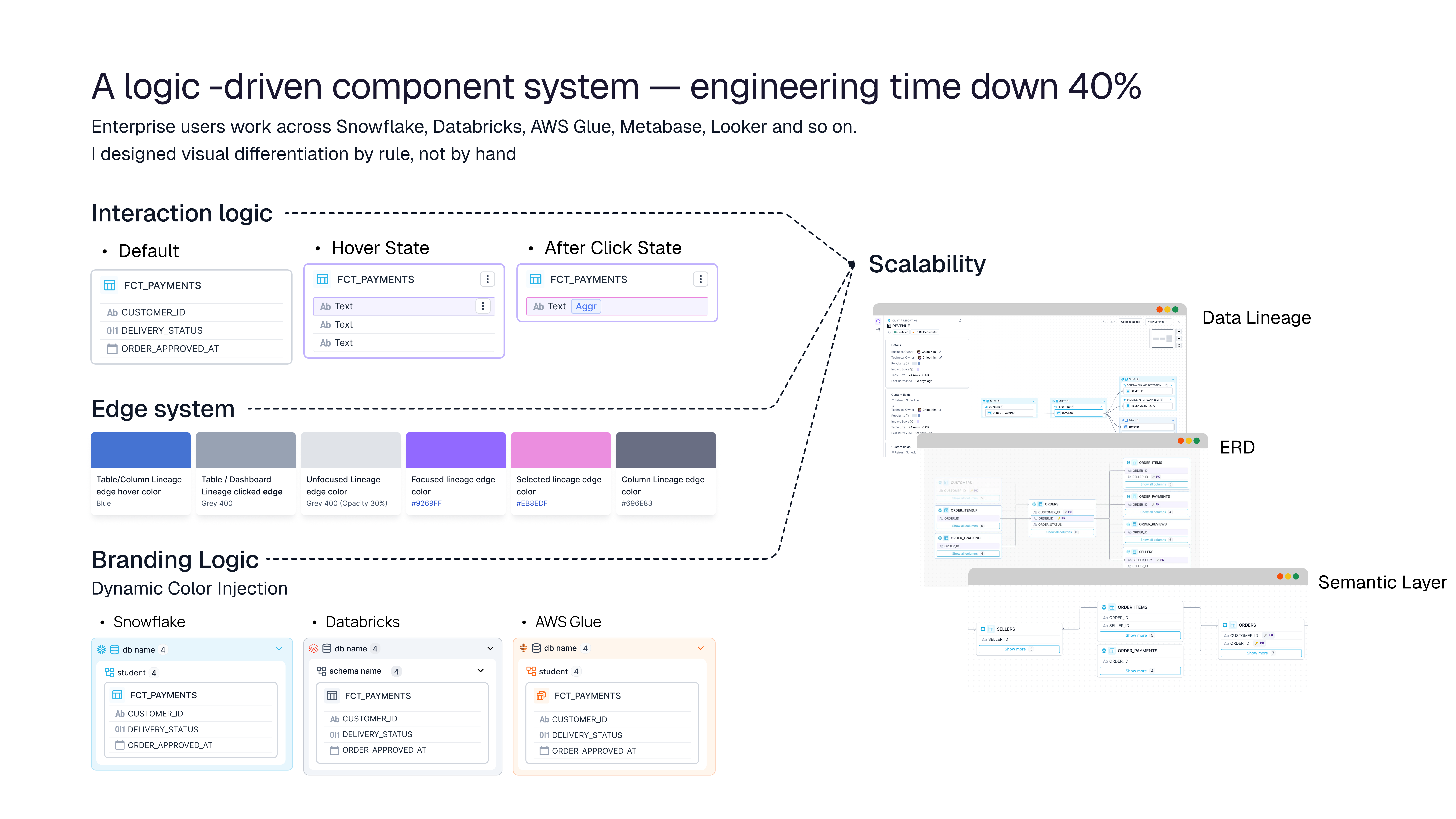
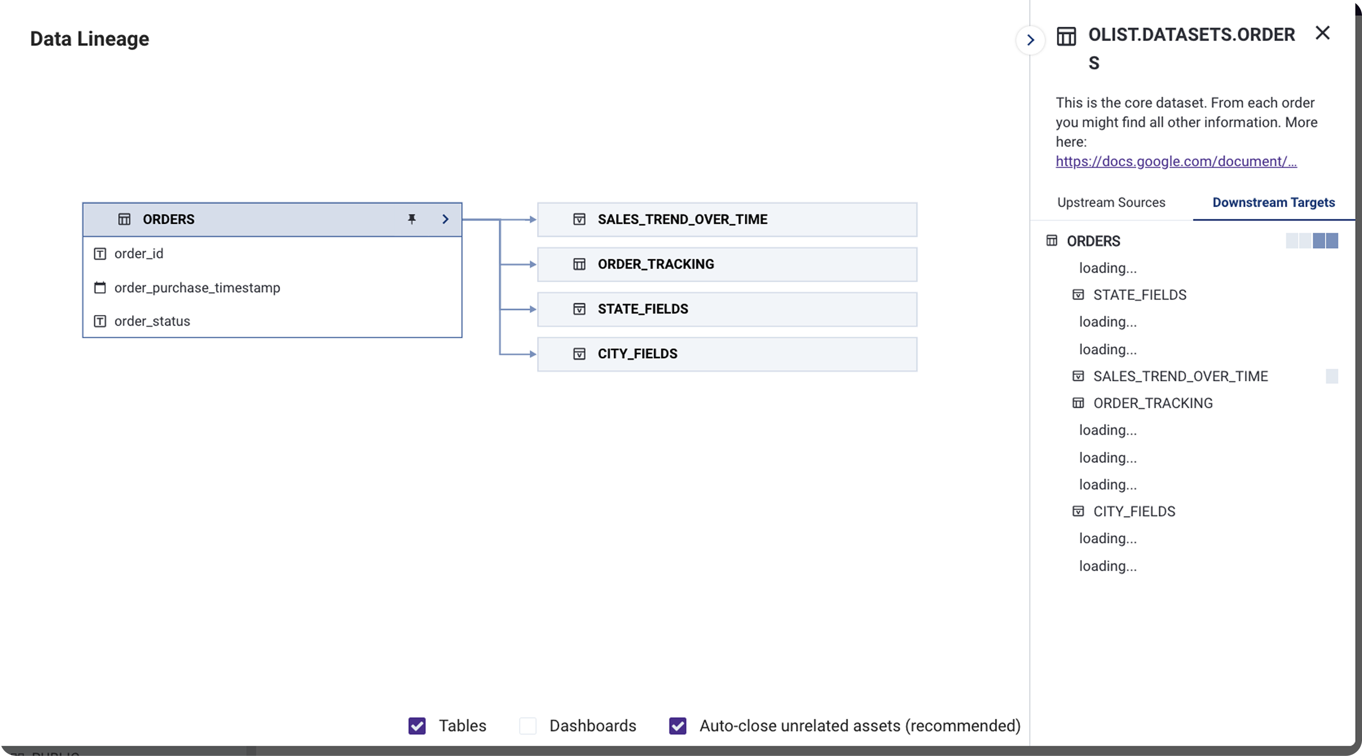
A consistent visual language for upstream, downstream, and column-level dependencies that scales across thousands of nodes without becoming noise.
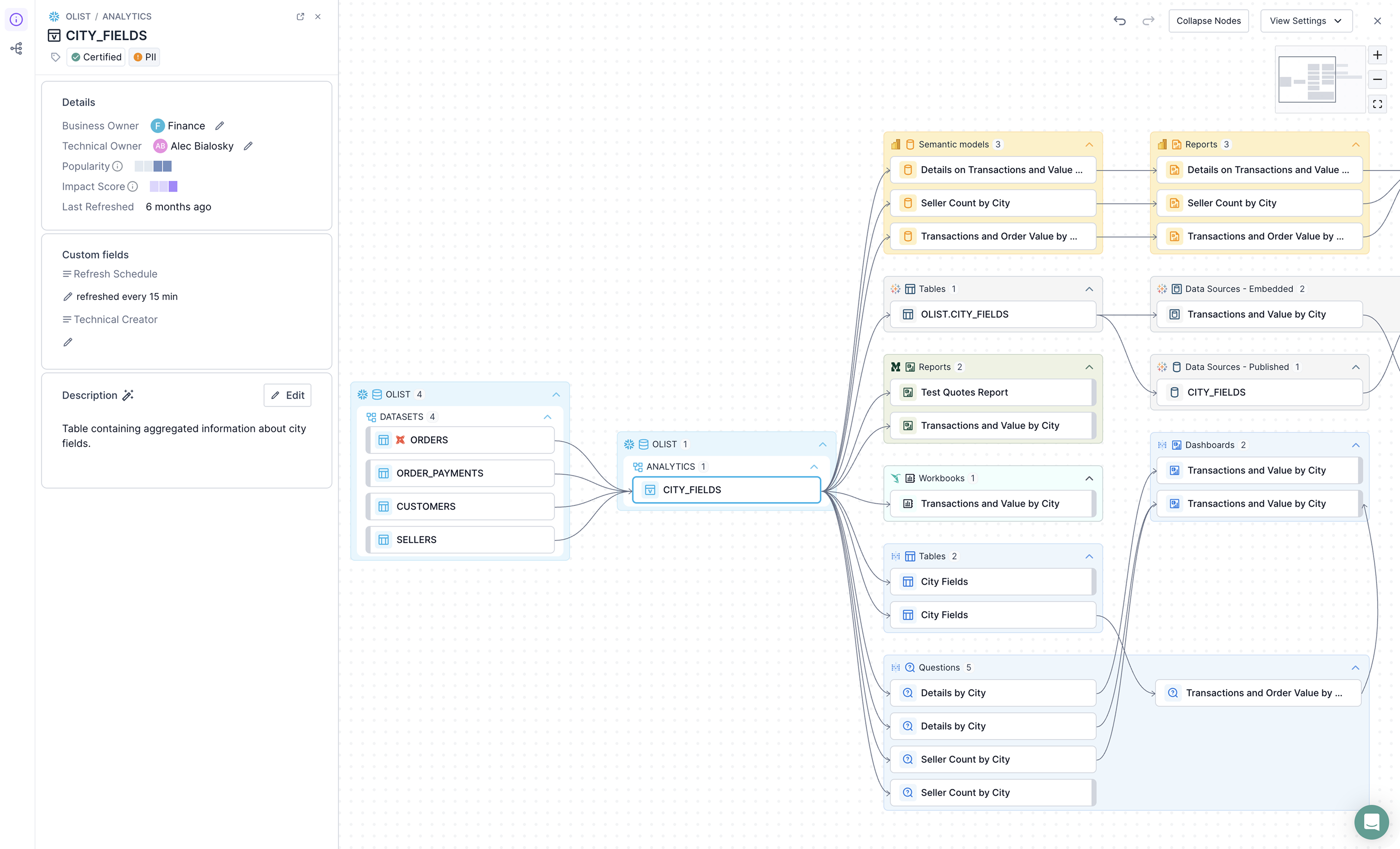
I designed the new lineage components to be reusable across product surfaces. After shipping in Lineage, the same system extended to ERD and Semantic Layer, cutting component build time by 40%.
Enterprise users move between Snowflake, BigQuery, dbt, Looker and more. Clear visual differentiation between sources reduced cognitive load when reading complex flows.
Outcomes & Impact
Shipped as the new default for all enterprise customers
The redesign became one of Select Star's strongest differentiators in late-stage enterprise sales — and a contributing factor to the company's acquisition by Snowflake in December 2025.